

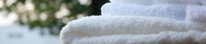
During the history of over 110 years in the northern part of Ehime Prefecture in Shikoku,
Combining the unique manufacturing technology with the high quality the area grew to be the largest towel production center.
The area can supply variety of towel (pile) items including the towels for the comfort when using them, those suitable for fashion and interior industries.
You can be rest assured that imabari towel will provide the world with quality for users’ peace of mind and,
design and technical capability to match the diversified life style.
Please do not hesitate to contact us since our production center is prepared to diversify needs of customers including OEM production, etc.
They indicate the towels are manufactured with the quality, innovation, uniqueness, reliability and kindness.
They also represent our spirit that we should not be satisfied with long tradition, but should continue challenges for materializing our great dreams.
The brand mark and logo are licensed by “Shikoku Towel Industry Association",
the body organized the towel manufacturers in the Japanese largest towel production center.
They guarantee that the towel products are of high quality which passed unique qualification standard.
They were chosen because,
“White” represents “the cloud in the sky” and “the kindness and cleanness of towel”.
“Blue” represents “the sea with shining waves” and “rich water”.
“Red” represents “rising sun” and “power of the production center”.
The fusion of various images, the new Japan wide brand, should represent our messages.
| ■RED The color symbolizes active, passion, innovation, vivid powerfulness, motion and impact, etc. It is intended that the existence of imabari towel itself catch the attention in the community and becomes one of the products which symbolizes Japan. |
|
| ■Blue A color which is loved by the people symbolizing safety and comfort on quality, reliability, history and tradition, brightness and calmness. It symbolizes the high quality stemming from the history and tradition of imabari towel. |
|
| □White Color with pureness symbolizing kindness, serenity, cleanness, cloudless, healing, sincerity and soft and tender love. It represents the expanse symbolizing the eternal potential. |
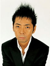
Art director and creative director. Born in 1965 in Tokyo.
Worked at Hakuhodo Inc. and later established “Samurai”.
The total creation based on innovative point of view and strong visual development demonstrated in art works for SMAP, product development and advertisement campaign for Kirin Gokunama, VI and space direction for TSUTAYA TOKYO ROPPONGI, brand building for Fast Retaining, Rakuten Group, Meiji Gakuin University and LISSAGE, art direction of NHK Educational TV “Lets’ play in English”, product design for NTT DoCoMo “FOMA N702iD/N703iD” and “Kids’ mobile phone”, creative direction for UNIQLO NY Global Flagship Store and UT STORE HARAJUKU and VI and symbol planning for National Art Center is highly regarded.
His book “Super sort out by Kashiwa SATOH” (Nikkei Publishing Inc.) was the best seller in 2007.In imabari towel project he was involved in the designing of brand mark and logo, designing of original design towels as the imabari towel Brand Building Project Creative Director.